A Brighter Year
An explanation for our annual new year's poster led us to an exploration of paintings by one of our own.
01.21.2021

Each January we commemorate the new year with a poster. It’s our outspoken way of leaving behind and beginning anew. Standing at this end of 2020, we wanted to give one last bold shout at the year that was. GET LOST, 2020. Here’s to a brighter 2021.
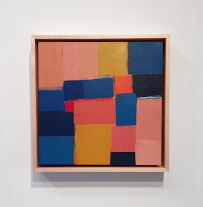
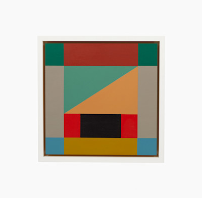
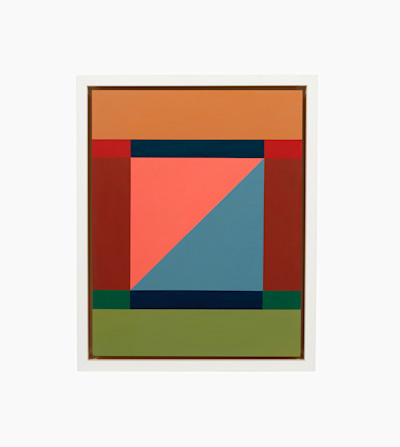
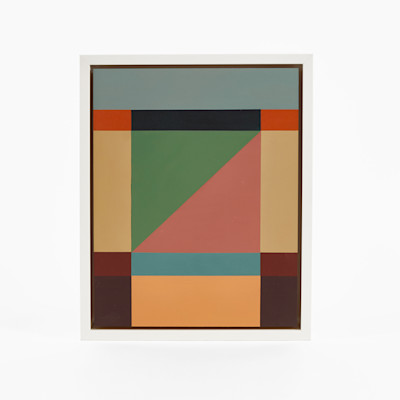
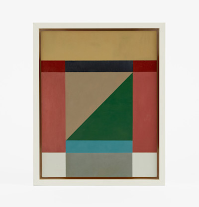
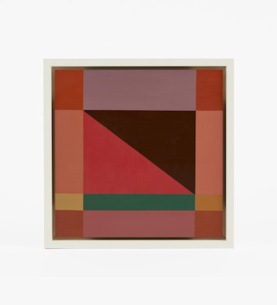
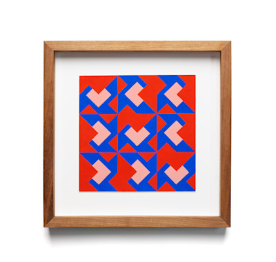
The graphic for our poster this year is an original artwork by our very own principal, Steven Johanknecht. In the process of writing something about it we felt it would be a timely opportunity to dive deeper into Steven’s paintings. We asked Steven to write something about their origins and whatever feels relevant as a designer. Prompted by his writing, we followed with a few questions.
—
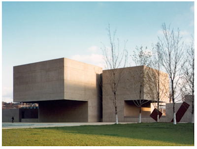
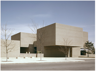
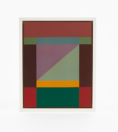
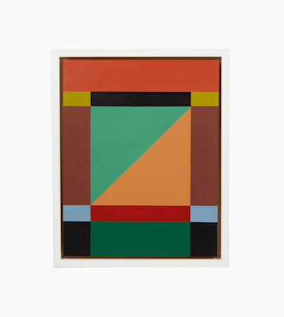
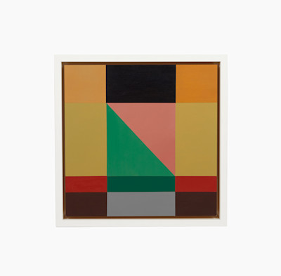
As a teenager growing up in Syracuse NY I was obsessed with the Everson Museum designed by I.M. Pei and completed in 1968. The concrete brutalist building is an exquisitely proportioned abstract sculpture unto itself and still remains one of my favorite buildings. There I was, first introduced to abstract painting and sculpture through works in their permanent collection by Helen Frankenthaler, David Smith, Henry Moore, Morris Louis, Al Held, Josef Albers, as well as other traveling exhibitions that now had a proper home in our town. In college I started out in a program called Communication Design, thinking it would lead me to a career in advertising, but I was much more interested in painting and art history and ended up transferring to a painting program in Italy. After spending a year in Rome, I traveled throughout Europe. The Pompidou Centre by Renzo Piano had recently opened in Paris in 1977 and was another building that blew my mind! As an art student I was always drawn to abstract movements: Abstract Expressionism, Constructivism, De Stijl and The Bauhaus. Looking back at my own work it’s always been my natural instinct to depict the world in abstract forms and my approach has mostly been to start from a place of pure abstraction, rather than an abstraction of reality.
After school I moved to NYC and got busy working. I had a lapse of painting for a number of years but was grateful to have interesting creative jobs and started working on interiors and designing spaces. Moving to LA years later allowed me the space to paint again and I found that my work naturally returned to the themes and explorations I had started early on… I couldn’t help it.
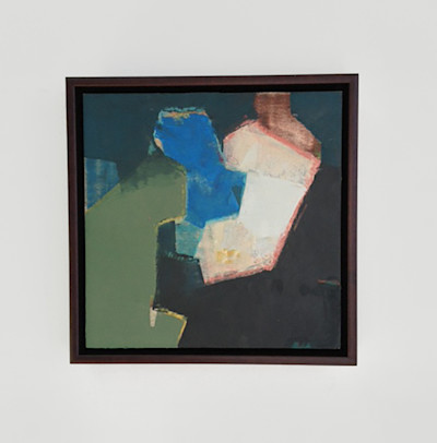
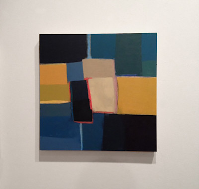
A few years ago I moved into an apartment and started working on a smaller scale in my library. Being more closely connected to my actual living space has been nice for now. I like the intimate and “object” quality of a small painting. Working in this size also allows me to work on a number of paintings at the same time and let some sit aside during my process. I used the solitude of being home all the time during the 2020 lock down as an opportunity to focus. There was a strange freedom that came along with it. My compositions develop through a series of both conscious and unconscious decisions, one informs the other, and both are necessary for balance in my creative practice. Thought and emotion. I want the paintings to have order, but also a bit of visual tension.
—
Looking at your most recent work, this is a simple question, but a telling one: What is the first thing you do when you approach the start of a painting? Do you set out with a specific intention? Do you start with one colour and build the rest?
When I start a painting I have a process that gets me into it… I draw a composition (often in response to other compositions I have done) I begin with one color.. and that color dictates the next moves with regard to color. The compositions then develop through a series of conscious and unconscious decisions. I follow the path where it leads me. I make these moves until everything co-exists with a depth and intensity that seems balanced to me. They sort of paint themselves at a certain point.
Of course, colour is quite indicative of mood. As your work is so heavily focused on colour, I’m curious if 2020 left its mark on the content of your paintings (and not just the size, as you mention). Have you seen your paintings develop and reflect the changing moods over the course of this tumultuous year? Is this reflected throughout your career as a painter? I wonder how the light in California versus your childhood in New York has influenced the changing colours of your paintings.
I haven't consciously noticed the impact of this past year with regard to color… however the paintings are more hard edge and graphic than some paintings of the past. I hadn’t really thought about it, perhaps some subconscious attempt to create order during times of chaos?? If anything being at home during the quarantine gave me an opportunity to focus more and just be closer to what I’m working on. I try not to confine myself at all with color, it's about freedom to explore the relationships of shapes and adjacencies of both scale and color. There are times I’ve set out to explore something monochromatic or neutral but the work usually ends up with more color. I may force myself again to see what comes out. I try not to over think any of it and just let it happen. I suppose I’m influenced by the light of California, I don’t really notice. It’s not like work done in upstate NY was mostly gray. My eye for color has just developed over time and is influenced by so many things.
I’m interested in digging deeper into this link between facing a blank canvas and facing a blank room. Colour and shape are inextricably tied throughout the interior design process, and evidently so in your painting. I’m curious how your painting work informs your design process. Does your colour palette inform your shape or vise versa? Your paintings are studies in colour in their own right, and would make beautiful palettes for room schemes. Do you ever consider this while you’re painting?
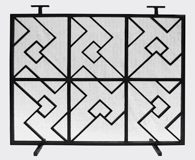
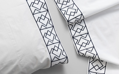
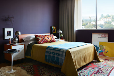
I don’t think about interiors or establishing color palettes when painting, or vice versa. If it happens it’s completely unconscious. My eye just tries to achieve a certain balance in the work I do. I chose the deep saturated Farrow and Ball color Pelt for my own bedroom with the color of the landscape outside the window of Griffith Park in mind, there are times of the day that the hills have a purple hue. A connection can be made between my painting and the interior design process for me. Often I approach a project much like a painting, an interior space must have a good balance of composition, scale, color and little visual tension to be successful. One needs to have a plan, but it’s also good to let a space evolve a bit along the way. In that way the process can be similar for me. My painting practice is total freedom for me, though. Our work at Commune is fully about our clients and in the service of the best creative solutions for the projects. It's never just about what I want, there’s collaboration. We also collaborate with artists, artisans and makers on product designs. I stumbled upon a painting way back from my student foundation course studies when I was clearing out my parent’s garage. The design from the painting became something we reinterpreted and has been used for a fireplace screen, textiles and an upcoming carpet pattern with Christopher Farr. I love having each of these creative outlets in my life.